Forms#
As described in the ui json section, a UI is typically made up of several forms that capture choices made by users and delivered to a Python program. The following sections describe the various form types that are currently available.
Base form#
At a minimum, a form must have the following fields:
- “label”
str Name of the form displayed in the UI.
- “value”
varies The input value stored by the form. The form style determines the type of the value stored. The example shown below is an Integer form with several optional fields used.
{
     "input_form": {
         "label": "Input",
         "value": 1,
         "main": true,
         "tooltip": "My message to the user",
         "optional": true,
         "enabled": true,
         "visible": true
    }
}
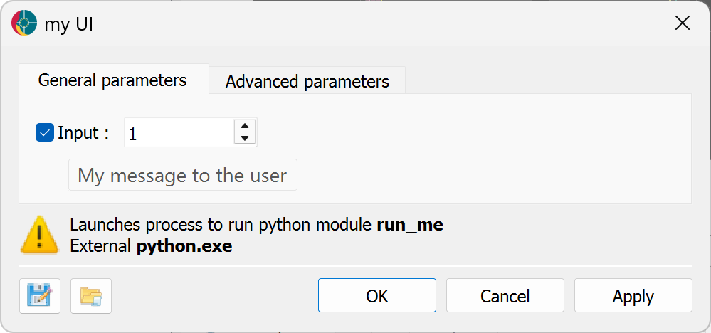
Optional fields#
The following optional fields can be used to customize the UI. These fields are available for all parameter types unless otherwise specified.
- “main”
bool Boolean whether the parameter shows in the (true)
General parametersor (false)Advanced parameterstabs. The default is false.- “tooltip”
str A string that describes the parameter. This is displayed when the user hovers over the parameter in the UI.
- “enabled”
bool Boolean whether the parameter is enabled (true) or disabled (false). The default is true.
- “optional”
bool Boolean whether the parameter is optional (true) or required (false). The default is false. A checkbox is displayed in the UI to allow the user to select whether to use the parameter or not.
- “visible”
bool Boolean whether the form is displayed. This option is generally used for advanced parameters that are enabled by the Python program itself. The default is true.
See the Form dependencies section for additional inter-form customization.
Boolean form#
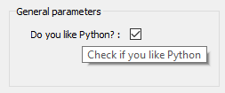
A Boolean form holds a bool value (true or false), rendered as a checkbox option.
{
    "input":{
        "label": "Do you like Python?",
        "value": true,
        "tooltip": "Check if you like Python"
    }
}
Integer form#
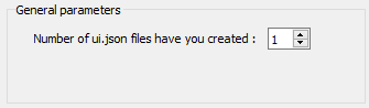
A parameter that has an int value type. The optional parameters are:
- “min”
int Minimum value allowed for validator of the value member.
- “max”
int Maximum value allowed for validator of the value member.
{
    "file_number":{
        "label": "File UI",
        "value": 1,
        "min": 0,
        "max": 100
    }
}
Float form#
A parameter that has a float value. The optional parameters are:
- “min”
float Minimum value allowed for validator of the value member. The default is the minimum numeric limits of float.
- “max”
float Maximum value allowed for validator of the value member. The default is the maximum numeric limits of float.
- “lineEdit”
bool Boolean whether to use a line edit (true) or a spin box (false). The default is true.
- “precision”
int Number of decimal places in the line edit or spin box
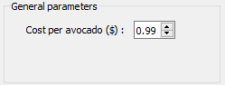
{
    "avocado": {
        "label": "Cost per avocado ($)",
        "value": 0.99,
        "lineEdit": false,
        "min": 0.29,
        "max": 2.79,
        "precision": 2
    }
}
String form#
For a simple string parameter, use an empty str value to have an empty string. The optional parameters are:
- “textBox”:
bool, Boolean whether to use a text box (true) or a line edit (false). The default is false.
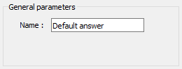
{
     "my_string": {
         "label": "Name",
         "value": "Default answer",
         "textBox": true
    }
}
Label form#
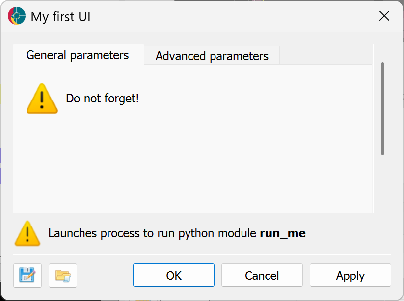
A Label form is a text label that can be used to display information to the user. Contrary to other form types, the value field must be set to null. Optional fields include
- “icon”
str A string that describes the icon to display next to the label. The default is no icon. The following icons are available:
warning,information,critical,question.
{
    "my_label": {
        "main": true,
        "label": "Do not forget!",
        "value": null,
        "icon": "warning"
    }
}
Radio label form#
Radio label parameters allow for a two-choice radio button with label choices. Any label value in the subsequent forms that matches value will change on selection. The optional parameters are:
- “originalLabel”
str First label for the radio button.
- “alternateLabel”
str Second label for the radio button.
- “value”
str String matching one of the original or alternate label.
{
    "model_type": {
        "group": "Models",
        "label": "Model type",
        "originalLabel": "Conductivity",
        "alternateLabel": "Resistivity",
        "value": "Conductivity",
        "enabled": true
    },
    "conductivity_model": {
        "group": "Models",
        "label": "Conductivity model",
        "value": 0.1
    }
}


Multi-choice string form#
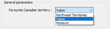
For a dropdown selection of choice list.
- “choiceList”
str A list of strings to choose from in the dropdown.
- “multiSelect”
bool A boolean to allow for multi-selection.
{
    "favourites": {
        "choiceList": [
            "Northwest Territories",
            "Yukon",
            "Nunavut"
        ],
        "multiSelect": false,
        "label": "Favourite Canadian territory",
        "value": "Yukon"
    }
}
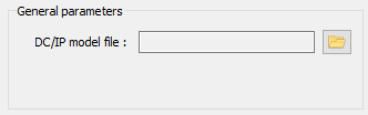
File form#
A file parameter comes with an icon to choose the file, with a str value.
- “fileDescription”
str Describes the type of file to filter.
- “fileType”
str File extension to filter from. If multiple file types are given, the user will be able to select from a dropdown of the file types.
{
    "model_file": {
        "fileDescription": ["Chargeability", "Conductivity"],
        "fileType": ["chg", "con"],
        "label": "DC/IP model file",
        "value": ""
    }
}

Group form#
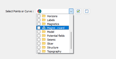
The group parameter can be used to select groups within ANALYST.
- “groupType”
uuidorlist[uuid] A single entry or a list of known group types. A complete list of UUID’s for geoh5 group types are available in the geoh5 groups documentation page.
- “multiSelect”
bool Option to allow selecting more than one group.
The value returned is the UUID of the ANALYST object selected, or a list of UUID’s if many have been selected with the multiSelect option.
{
    "my_group": {
        "groupType": [
          "{61fbb4e8-a480-11e3-8d5a-2776bdf4f982}",
          "{55ed3daf-c192-4d4b-a439-60fa987fe2b8}"
        ],
        "multiSelect": false,
        "label": "Select Points or Curve",
        "value": ""
    }
}
Drillhole Group data form#
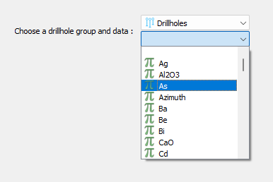
The Drillhole group data parameter allows users to select a drillhole group and one or more data channels from the group.
- “groupType”
uuid Required type uuid of the drillhole group.
- “groupValue”
str Name of the data group to filter data names from.
{
    "my_group_data": {
        "label": "Choose a drillhole group and data",
        "groupType": "{825424fb-c2c6-4fea-9f2b-6cd00023d393}",
        "groupValue": "",
        "multiselect": true,
        "value": ""
    }
}
Object form#
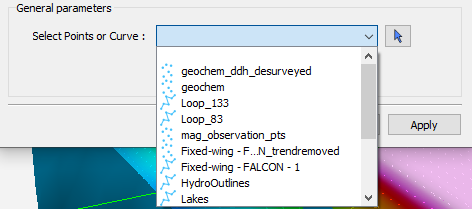
The object parameter allows users to select geoh5py objects from a dropdown in ANALYST.
- “meshType”
uuidorlist[uuid] A list of UUID of name of object type required to filter the Object Type available in the dropdown. A complete list of UUID’s for geoh5 object types are available in the geoh5 objects documentation page.
- “multiSelect”
bool Option to allow selecting more than one object.
The value returned is the uuid of the ANALYST object selected, or a list of uuids if many have been selected with the multiSelect option.
{
    "interesting_object": {
        "meshType": [
            "Points",
            "Curve"
        ],
        "multiSelect": false,
        "label": "Select Points or Curve",
        "value": ""
    }
}
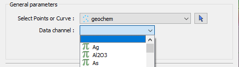
Data form#
Data selector from a parent object. The required fields are:
- “dataType”
str Describes the type of data to filter. One or more (as an array) of these key words:
Integer,Float,Text,Referenced,Vector,DataTime,GeometricorBoolean.- “dataGroupType” (optional)
str To allow choosing a data group, the user can replace the dataType member with the dataGroupType and provide a single or array of the following strings
3D vector,Dip direction & dip,Strike & dip, orMulti-element.- “association”
str Describes the geometry of the data. One or more of these key words:
Vertex,Cell, orFace.- “parent”
str Name of the parent (Object form) to filter a list of data from.
{
    "data_mesh": {
        "meshType": [
            "{202C5DB1-A56D-4004-9CAD-BAAFD8899406}",
            "{6A057FDC-B355-11E3-95BE-FD84A7FFCB88}"
        ],
        "label": "Select Points or Curve",
        "value": ""
    },
    "data_channel": {
        "association": "Vertex",
        "dataType": "Float",
        "label": "Data channel",
        "parent": "data_mesh",
        "value": ""
    }
}
Data or value form#
In some cases, a parameter may take its data from a object or simply a float value.
{
    "data_mesh": {
    "meshType": [
            "{202C5DB1-A56D-4004-9CAD-BAAFD8899406}",
            "{6A057FDC-B355-11E3-95BE-FD84A7FFCB88}"
        ],
        "label": "Select Points or Curve",
        "value": ""
    },
    "uncertainty_channel": {
        "association": "Vertex",
        "dataType": "Float",
        "isValue": true,
        "property": "",
        "min": 0.001,
        "label": "Uncertainty",
        "parent": "data_mesh",
        "value": 1.0
    }
}
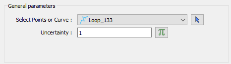
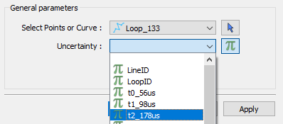
Users can switch between the isValue and property by clicking the \(\pi\) icon. Just like the Data form the property field depends on the parent object.
Range slider form#
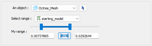
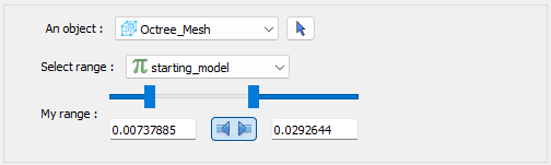
The range slider parameter allows users to select a data channel and select a range of values from within the data bounds. The following fields are required:
- “rangeLabel”
str Label for the range slider.
- “allowComplement”
bool Boolean whether to allow the user to flip the inclusion from within the bounds to outside the bounds. The default is false.
- “isComplement”
bool Boolean whether the range is currently set to include values within the bounds (false) or outside the bounds (true). The default is false.
Compared to the Data or value form, the property will contain the uuid to the selected data, whereas the value will contain the range values.
{
    "my_object": {
        "label": "An object",
        "meshType": "{4ea87376-3ece-438b-bf12-3479733ded46}",
        "value": ""
    },
    "range_data": {
        "label": "Select range",
        "allowComplement": true,
        "isComplement": false,
        "parent": "my_object",
        "property": "",
        "association": "Cell",
        "dataType": "Float",
        "value": 0.0,
        "rangeLabel": "My range"
    }
}
Dependencies#
Additional customization of the UI can be achieved by creating dependencies between parameters. The following fields are available for all parameter types unless otherwise specified.
Form dependencies#
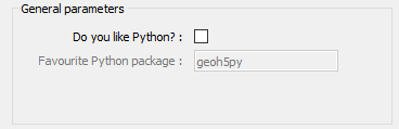
Forms can be enabled or disabled based on the value of another parameter. The parameter driving the dependency must contain an optional field or be a Boolean form.
- “dependency”
str Name of parameter that controls the enabled or visible state of the ui element.
- “dependencyType”
str One of
enabled,disabled,showorhide. Controls whether the form is enabled/disabled or shown/hidden based on the dependency.
{
     "python_interest": {
        "label": "Do you like Python?",
        "value": false,
        "tooltip": "Check if you like Python"
     },
     "favourite_package": {
         "label": "Favourite Python package",
         "value": "geoh5py",
         "dependency": "python_interest",
         "dependencyType": "enabled"
     }
}
Groups#
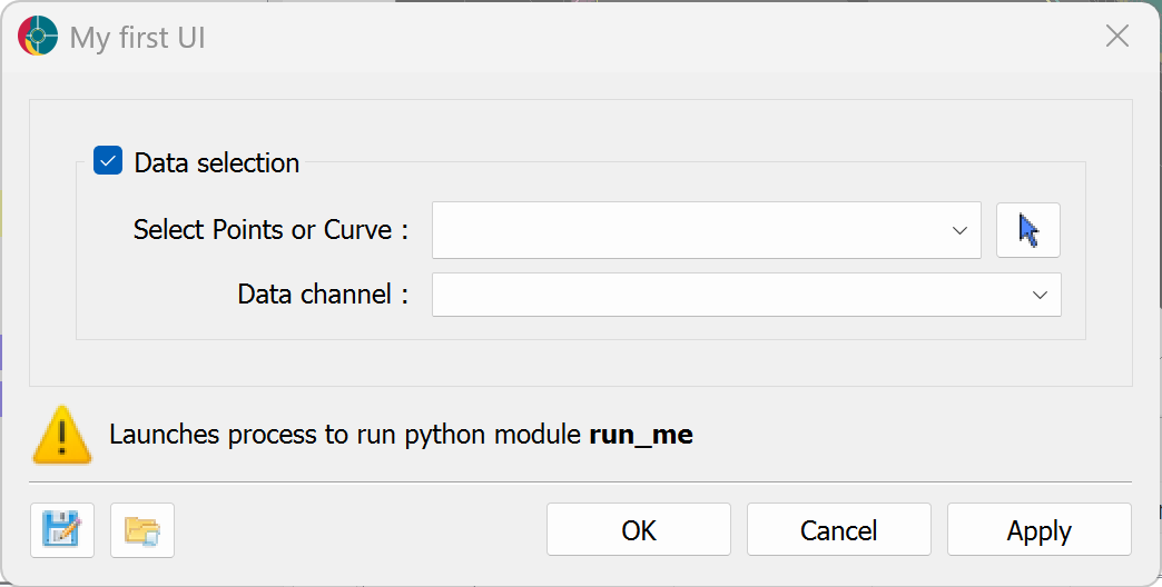
Forms can be grouped together to create a more organized UI. If set optional, the lead form of a group dictates the state of the group.
- “group”
str Group name for UI elements. All forms within the group are rendered within a box labelled with the group name.
- “groupOptional”
bool If True, UI group is rendered with a checkbox that controls the enabled state of all of the groups members. Only the first member of the group should have this member set to True.
{
    "data_mesh": {
        "meshType": [
            "{202C5DB1-A56D-4004-9CAD-BAAFD8899406}",
            "{6A057FDC-B355-11E3-95BE-FD84A7FFCB88}"
        ],
        "label": "Select Points or Curve",
        "value": "",
        "group": "Data selection",
        "groupOptional": true,
        "enabled": true
    },
    "data_channel": {
        "association": "Vertex",
        "dataType": "Float",
        "label": "Data channel",
        "parent": "data_mesh",
        "value": "",
        "group": "Data selection"
    }
}
Group dependencies#
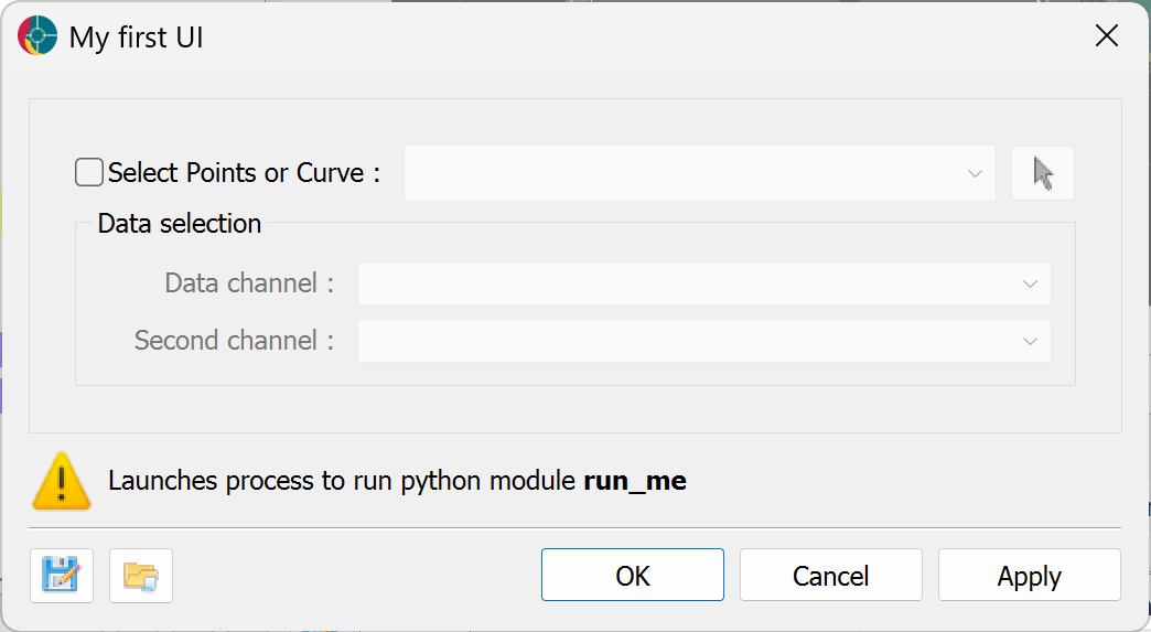
A group of UI elements can be enabled or disabled based on the state of a parameter outside the group. The parameter driving the dependency must contain an optional field or be a Boolean form.
- “groupDependency”
str Name of the form that controls the enabled or visible state of the ui group.
- “groupDependencyType”
str Controls whether the ui group is
enabledordisabledwhen the form dependency is enabled if optional or True if a bool type.
{
    "data_mesh": {
        "meshType": [
            "{202C5DB1-A56D-4004-9CAD-BAAFD8899406}",
            "{6A057FDC-B355-11E3-95BE-FD84A7FFCB88}"
        ],
        "label": "Select Points or Curve",
        "value": "",
        "optional": true,
        "main": true,
        "enabled": true
    },
    "data_channel": {
        "association": "Vertex",
        "dataType": "Float",
        "label": "Data channel",
        "parent": "data_mesh",
        "value": "",
        "main": true,
        "group": "Data selection"
    },
    "favourite_package": {
        "association": "Vertex",
        "dataType": "Float",
        "label": "Second channel",
        "parent": "data_mesh",
        "value": "",
        "group": "Data selection",
        "groupDependency": "data_mesh",
        "main": true,
        "enabled": false,
        "groupDependencyType": "enabled"
    }
}
General Tips#
Keep labels concise
Write detailed tooltips
Group related attributes
Don’t include the main member with every parameter. “Non-main” members are designated to a second page under Optional parameters
Utilize optional object members and dependencies.